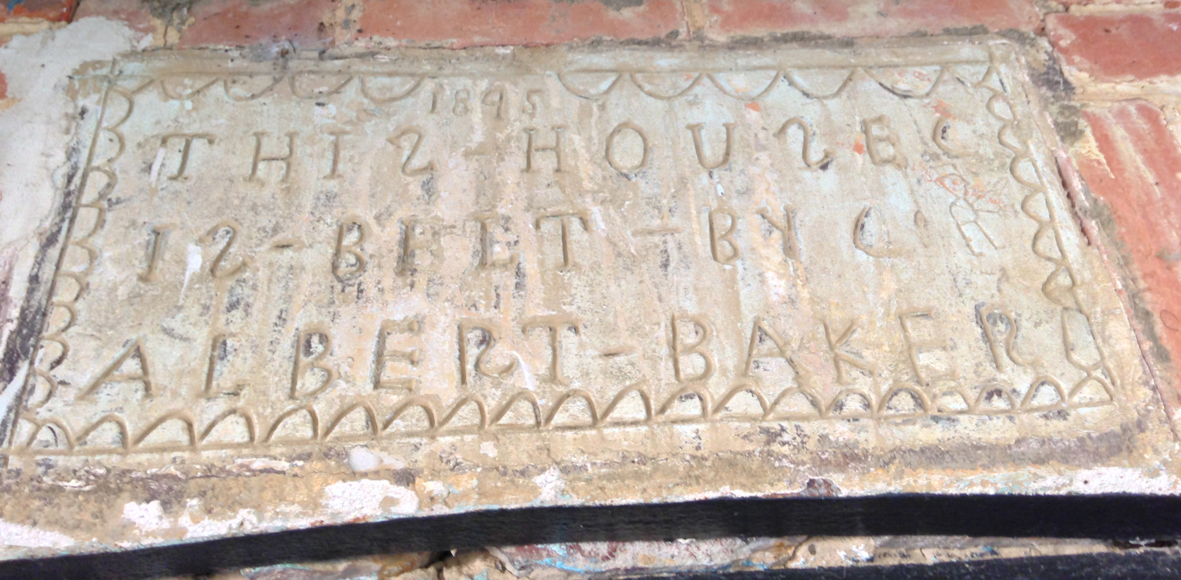
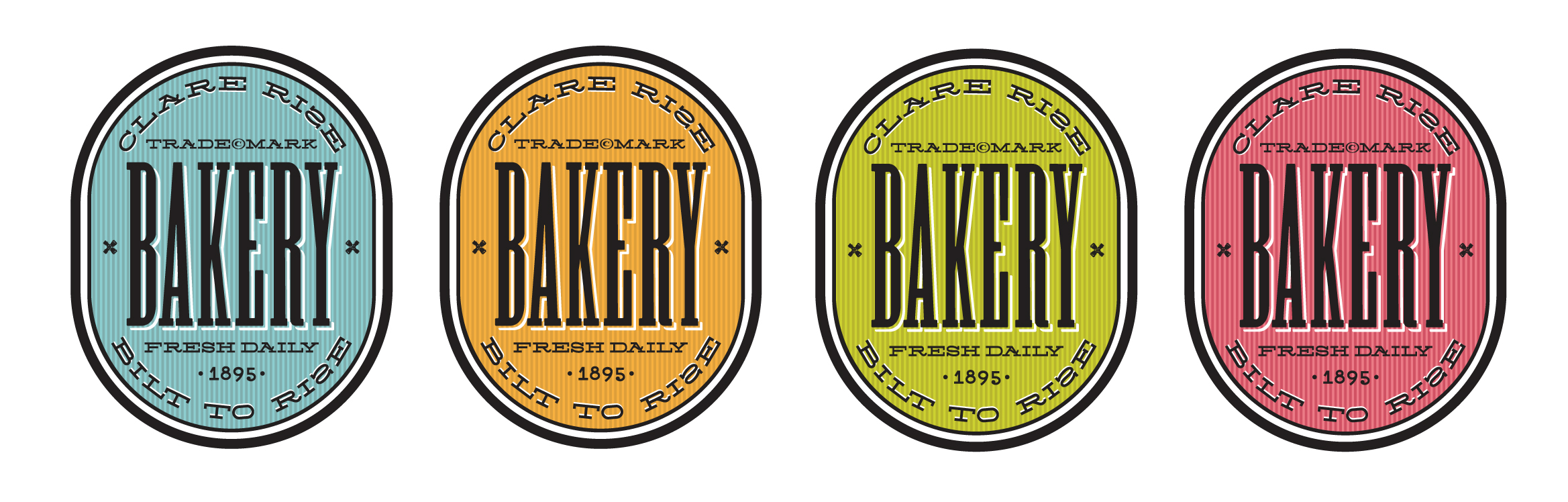
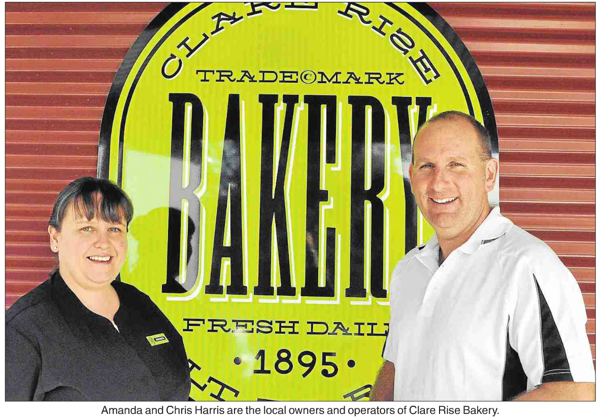
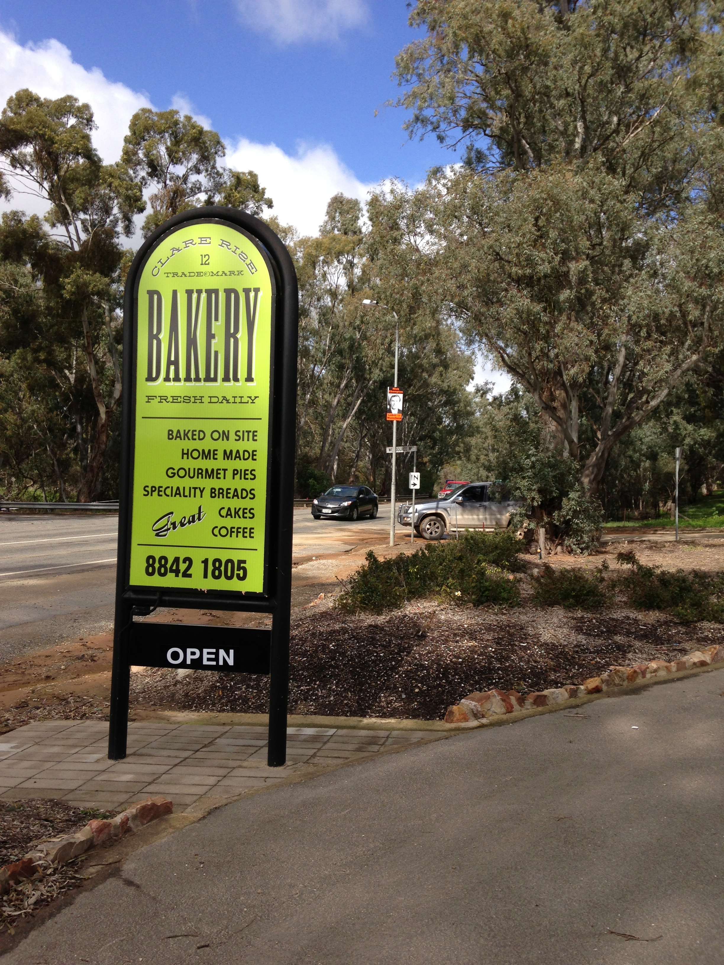
Working with Chris and Amanda Harris to develop the style, logo and market approach for the Clare Rise Bakery uncovered some of the history of the stone cottage. The 1895 hand-made foundation stone contains some interesting phonetic spelling and hieroglyphs which we decided to incorporate into the 2014 branding.
I have been working with Sport SA on different projects for a number of years, and details have now been formalised for the inaugural Adelaide Sport Fitness and Health Festival set down for December 7th and 8th this year at the Festival Centre and Riverbank Precinct, what a fabulous showcase.
The Festival will include a Fitness and Health Expo in the Festival Centre precinct as well as a Sport focused Exhibition with Activity Zones at Elder Park and the Event Space outside Regattas Restaurant. The Torrens Parade Ground and upper level Festival Centre Plaza will also host a range of demonstrations and pop up activities.
Festival Manager Peter Spry will be contacting all Sport SA members and other interested parties in the next two weeks seeking expressions of interest in taking up exhibitor sites as well as sponsorship opportunities. Later this month a NEW Festival website link will showcase on the NEWSport SA website.
gthink creative has recently been appointed to Sales + Distribution for Lacrosse Clothing with Burst Sport Clothing – Australia.
I have a long and solid history of supporting lacrosse and a strong knowledge of apparel design and manufacturing, combine that with the passion of Burst Sport Clothing and we have developed a brand for the young and determined, innovative and progressive. Created to satisfy those who want custom-made clothing with their own design and colours, people who want to identify them self and distinguish their group, for the team who wants to feel different and love something unique.
Made using the highest-quality materials and latest technologies, Burst have a passion for great apparel and a passion for their brand.
This commitment for quality lets you know that Burst will always offer you the best, quality and price.
Can I assist your club to look great on and off the field in the 2013 competition, pre-season orders are now open.
Perfect for club and tournament, events, mad monday and all-star teams, sublimation is a process in which your logo / designs are dyed directly to the fabric and so designs never fade or wear off. We have many garment styles available and you can add as many logos in as many colours in as many locations for one price. A dedicated graphic designer will design your apparel and work closely step by step to create a solution you will love.
Our shorts are made in a classic lacrosse cut with different fabric options available, including mesh, mock-mesh, and brushed polyester all with a 9″ inseam. We can also supply your shorts with pockets, piping, tapes and embroidery.
Burst Lacrosse is a leader in the sublimation industry providing professional design support to help your team design standout and original clothing. Please contact me to discuss your next sports uniform order. gregh@internode.on.net
Corporate, team wear, cycling apparel, designs for many sports, summer and winter competitions, school leaver hoodies and varsity jackets also available.
A unique box design working with the ‘Fig’ motif creates buyer interest when displayed in a retail setting. Application of brand to business cards, letterheads, notepads and advertising materials.
Brand Development – Graphic design – Willabrand Australia
Brand Development – Graphic design – Willabrand Australia
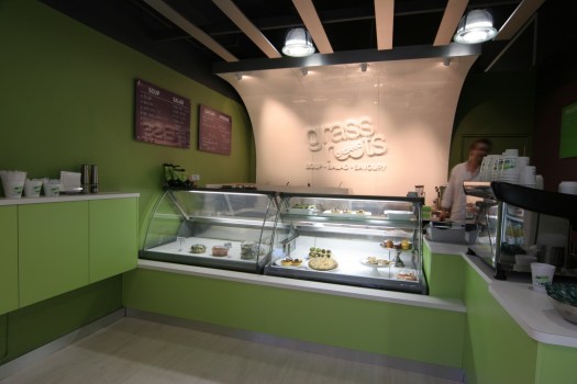
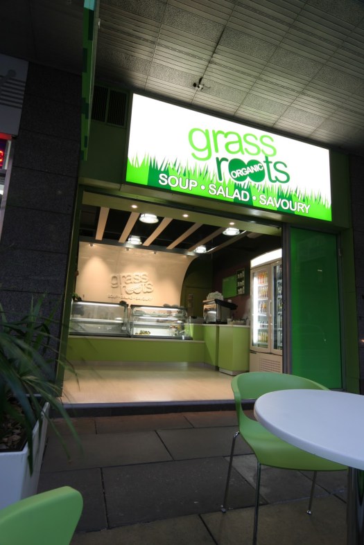
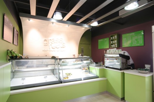
Marcus & Michael Breach opened the first Grass Roots store in early 2007 to live their dream of offering wholesome, fresh, quality food to the masses.
The grass Roots mission statement : ‘source quality, fresh ingredients and actively seek local and organic produce where possible.’
My brief was similar, into a tiny space, deliver a fresh, vibrant, modern and clean store environment with a vision to opening multiple outlets, each with a recognisable link and unique brand standout.
I followed the Aussie ute racing from when they first began and were known as “the V8 BRutes”, so with the call and the opportunity to work with Craig Denyer and Bill West at Spherix came the moment to fullfill a lifetime dream, the test … to design a mark and assist in creating a brand for this exciting category of motor racing.
Take an every day ute, Ford or Holden, make controlled and consistent modifications, insert driver, mix in some entertainment factor and you get …. “the category needs to be brutish to keep the fans pleased, but it also needs controlled costs and controlled driver standards. That can be a tough compromise, there needs to be the biff and bash, but if there is too much of it then teams may not survive the financial costs and teams disappear – not good for the vehicle sponsors or the corporate sponsors of the class itself.”
How to reflect that, a street sign concept, hazard stripes for the biff and bash, a wasp has a black yellow striped tail for a reason ! – add a traditional looking chrome badge for the name, apply the flexibility to adjust and the V8 utes brand was born, an exciting category of motor sport, I am excited to work with – ” Battle. Mêlée. Skirmish. Blood.
For 10+ years now the Australian V8 Ute Series provided it all. It sprouted with the need for support class entertainment for the masses, and there seems to be no stopping the gladiatorial juggernaut. Strangely enough that is exactly what the racing fan is wishing for.”
V8 Ute Racing Australia
V8 Ute Racing Australia
V8 Ute Racing Australia
V8 Ute Racing Australia
Graphic – Photographic assembly of components presenting V8 Ute racing Australia – SAGE Racing desktop screensaver
“When you engage Greg to design and develop a Graphic brand, logo or image for business, association, club, school or group, you will be well rewarded with outstanding work. He delivers the goods with creative interpretation and production expertise and all with seamless connectivity. I know that if you put yourself in these very capable hands your brand, company and offering will be enhanced and your audiences will be engaged. He has done this for me many times over many years. I recommend you give him a call and see how he can do this for you.” Marcus Battye Futureproof Communications
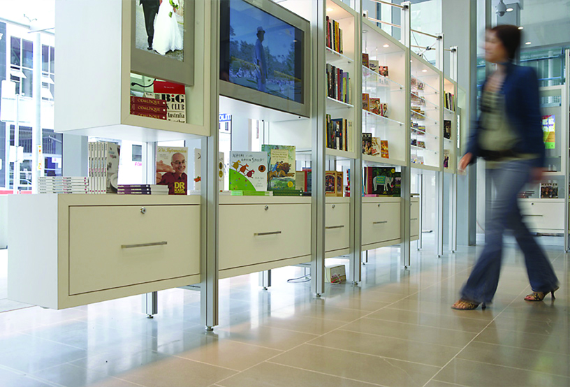
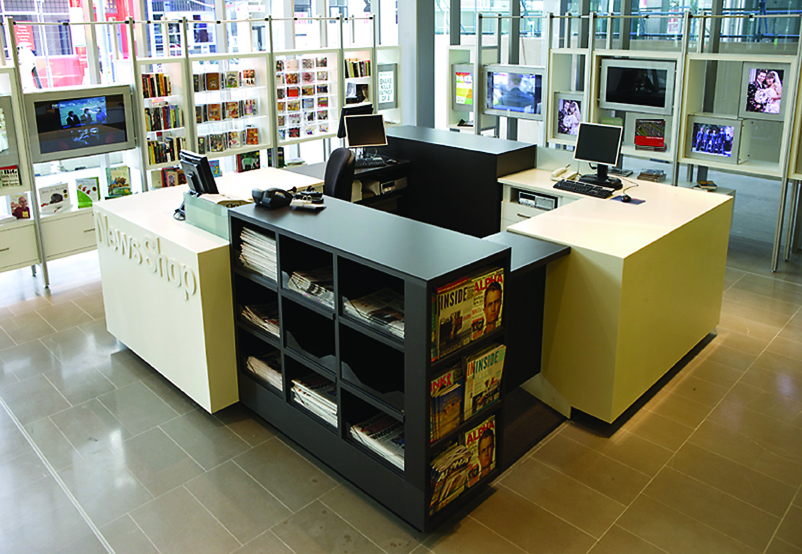
A central work station with raised floor, overlooks the window displays which utilise LCD screens to present images originally published in the The Advertiser newspaper. The units are light weight in a visual sense, not blocking your view in or out of the shop and making full use of the extensive glass in the building. Product can be viewed from both indoors and out, lighting and all electrical cabling is integrated creating a seamless, freestanding, Point of Sale (POS) presentation.
The 2010/11 SportSA Annual Report presents the success of the South Australian Sports Federation and was approached as an opportunity to communicate, reinforce and share the vision of the professional sports industry association. A 2o page report plus cover, design format, typeset and set for production – g-thinkcreative


