Furniture Design – Shopfit – The Advertiser ‘News Shop’

A central work station with raised floor, overlooks the window displays which utilise LCD screens to present images originally published in the The Advertiser newspaper. The units are light weight in a visual sense, not blocking your view in or out of the shop and making full use of the extensive glass in the building. Product can be viewed from both indoors and out, lighting and all electrical cabling is integrated creating a seamless, freestanding, Point of Sale (POS) presentation.

Graphic design – SportSA Annual Report

The 2010/11 SportSA Annual Report presents the success of the South Australian Sports Federation and was approached as an opportunity to communicate, reinforce and share the vision of the professional sports industry association. A 2o page report plus cover, design format, typeset and set for production – g-thinkcreative

Print production – Print Junction

graphic design – team and car graphics – SAGE Racing

I first prepared designs for SAGE Automation in 2001, their first year diving into V8 Ute racing.  I have designed the livery for the SAGE Racing Team every year since. Stay tuned for an update gallery of each design through the last ten years.  The livery shown developed for the start of the 2008 season has been carried through to date.
I am very proud to be associated with V8 Ute Racing and the SAGE Racing team.
2001 original design – built over a standard black ute, lots of sponsors, a very short time frame and set the scene for the next 7 years

Brand Development – Graphic design for ALA Australian Lacrosse Association

“The Australian Lacrosse Association aims to provide leadership through the delivery of quality sports services and programs which ensure increasing participation for all levels of lacrosse (players, coaches, officials, administrators), and delivers international success.”
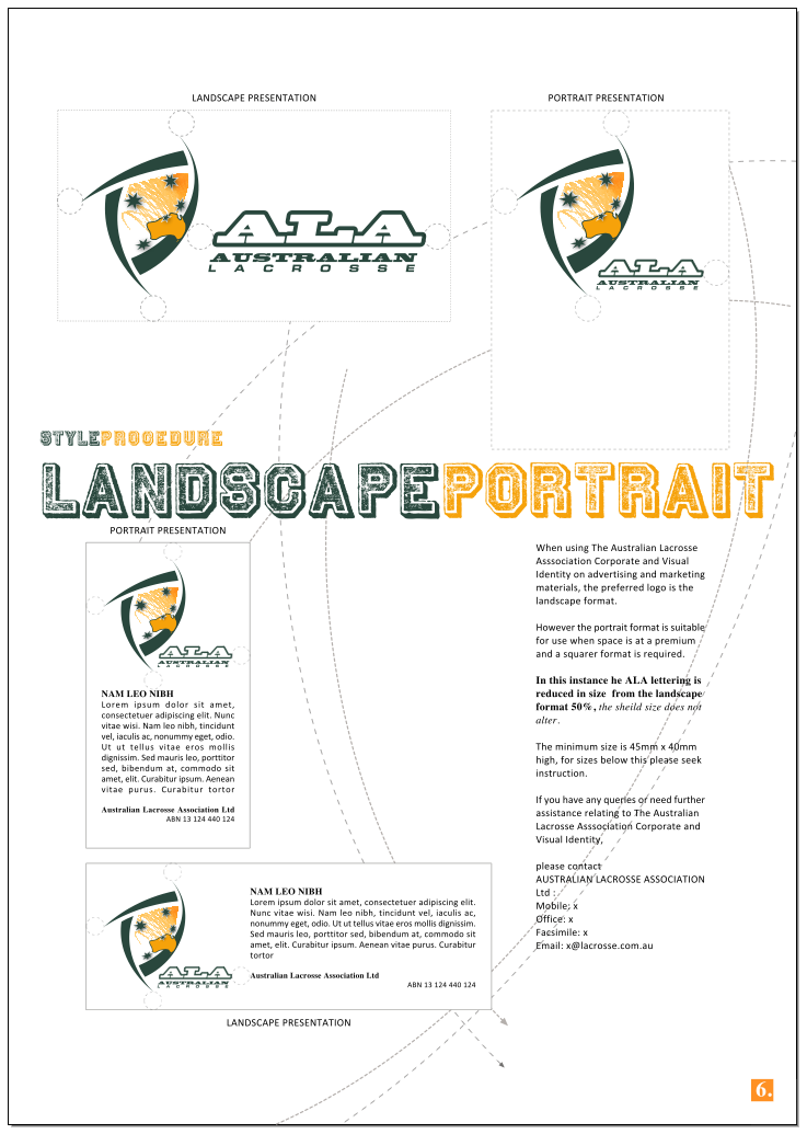
The Australian Lacrosse Asssociation Visual Identity comprises multiple components:
THE ‘SHEILD’
Lacrosse is a game of fluid activity, unique, with behind the goal tactics and bold individual goal scoring drives. The curving and arcing lines replicate the strength and activity of this great game. They are representative of the ball movements, player position and team strategy around the goal circle, whilst forming a triangular shape and stylised head of a Crosse, (lacrosse stick).
The AUSTRALIA OUTLINE is inclusive of all states.
The ALA comprises 6 member states –
New South Wales Lacrosse Inc., Queensland Lacrosse Association, Lacrosse South Australia, Lacrosse Tasmania, Lacrosse Victoria, Lacrosse West
With the key components connected by THE SOUTHERN CROSSE, our position within the world of lacrosse is reinforced as the “Team Down Under “.
The outer shape is strong and becomes “shield like” in it’s presentation providing positive attitude that Lacrosse in Australia is a country of winners.
Conceptual development, final art and style guide – Greg Hamilton

Australian Men’s Lacrosse Team – Team Uniform Designs 210

The Australian Men’s Lacrosse Team 2010, used two uniforms, as per tradition Green as the home strip and Yellow/Gold  as the away strip. Production techniques used on clothing ranged across sublimation printing, screen printing and embroidery with team requirements distributed across multiple suppliers. The team especially thanks Adidas Lacrosse for their support with uniforms and Lacrosse equipment including gloves, pads,sticks and warm up clothing. Boathouse Sports – Australia for their team clothing, jackets and reversible bibs. You can view images from the campaign at http://gallery.me.com/gregh6#gallery

Illustration – Team and Promotional Graphics – Australian Men’s Lacrosse Team

In 2010, the Australian Senior Men Lacrosse Team defended their 3rd ranked position at the World Lacrosse Championships, Manchester England.

Designs for the team , mascot, clothing and promotional materials were created by Greg Hamilton providing much needed support for the team. Promotional T-shirts, stickers, caps and  magnets were produced as fundraising items.

exhibition – RSB, The Royal Society for the Blind

The RSB is a not-for-profit organisation providing services to South Australians who have a severe vision impairment. These services are delivered by a professional, committed and highly qualified team supported by volunteers, drawn from all age groups and walks of life.

I am proud to have worked with the RSB in 2009, 2010 and 2011 with display, exhibition and merchandising design services, including their 125 year celebrations birthday cake, the 125 year history museum exhibit, concept development for new fund-raising boxes and  especially with the design and development of the Royal Adelaide Show exhibit , winning best exhibition stand in 2009, for all stands under 36m2.

Can I help you stand out from the crowd ?                                    (Photography – Lightly Salted Commercial Photography)

furniture – cellar door counter – Wirra Wirra Winery

Daring to be different, having a style and culture all of its own and ageing well were the criteria met in the creation of the Cellar Door furniture. The three dimensional facade of new and recycled hardwood combined with bronze coating and effective lighting represent the merging of design skills and celebrates the Wirra Wirra ethos. Behind the counter, sinks, wine and glass storage, as well as point of sale have all been considered for ease of use and practical effect.
Design Institute of Australia  – Commendation – high standards have been achieved, a recognition of professional design procedure and outcome.  SA Awards Program – 2004
“Wirra Wirra is a place that has inspired the most lateral of thinkers. The winery itself is a testament to some quirky ideas and inspired traditions, all of which have come from the freedom to explore possibilities. Serious fun is at the heart of all that has resulted.”   www.wirrawirra.com

ASC Australian Submarine Corporation

Standing in excess of five metres tall the ASC exhibit dominates the exhibition hall at the Adelaide Convention Centre. The stand has now been assembled, dis-assembled and re-assembled six times and currently is in storage ready for use at the next Defence and Industry Trade Show. Re-usability has always been important in my display planning.